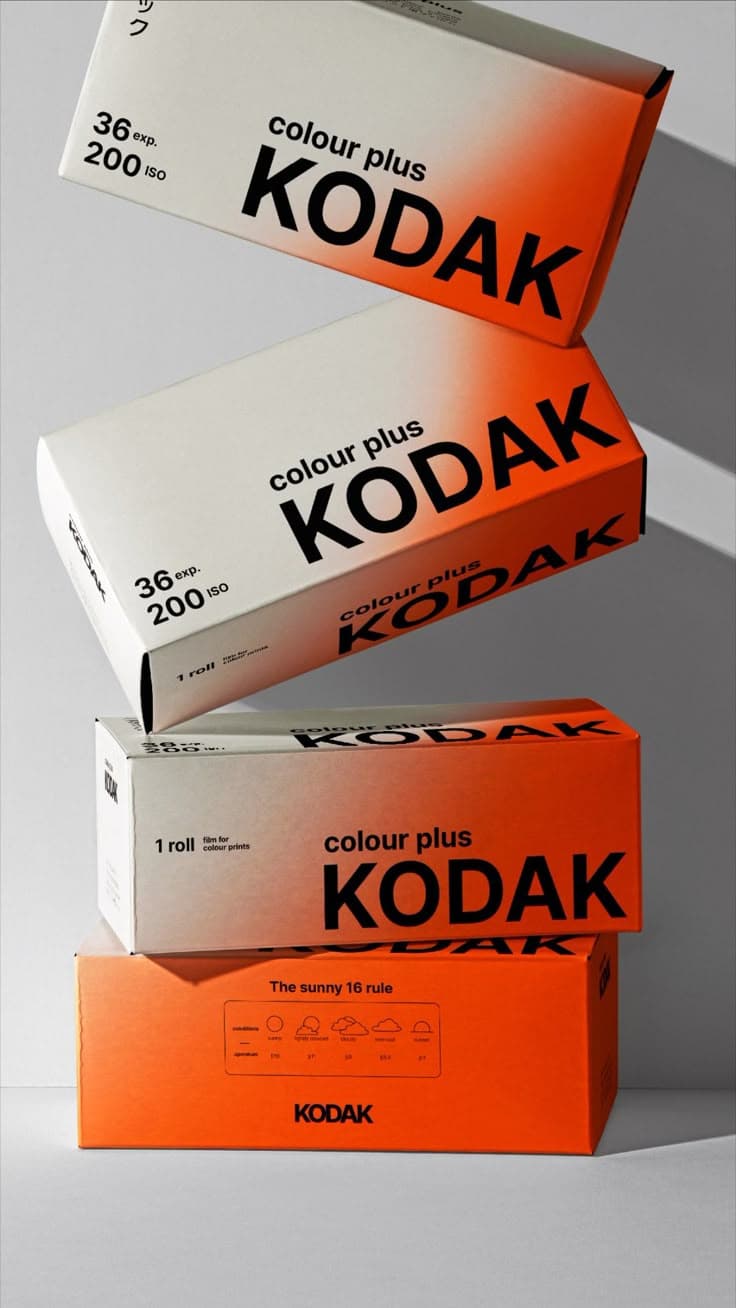
The Power of Empty Space in Minimal Packaging Design
Thoughtful empty space is not wasted space. In minimal packaging design, it creates clarity, hierarchy, and stronger long-term brand value.
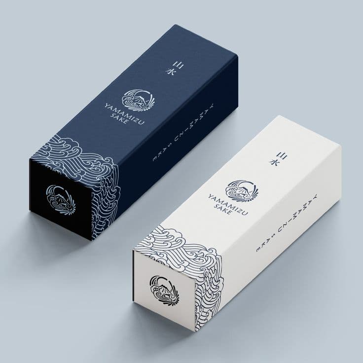
Why Empty Space Matters
Many people misunderstand the role of “empty space” in minimalist packaging design. They assume that a clean, simple layout means less effort, less creativity, or even a lack of design altogether.
In reality, the philosophy of “less is more” carries far greater value than visual aesthetics alone. Thoughtful minimal packaging can elevate a product, strengthen brand identity, and create a more refined consumer experience. This kind of “empty” design is not about doing nothing — it is about knowing what to include, and more importantly, what to leave out. That balance is the true soul of minimalist packaging design and one of the most powerful long-term branding strategies.
Standing Out in a Crowded Market
Today’s market is crowded with overdesigned packaging. Brands often try to compete by filling every inch with colours, patterns, icons, and text. While this may appear visually rich, it can quickly overwhelm consumers and make it harder for them to identify the product’s key message.
Minimal packaging design takes the opposite approach.
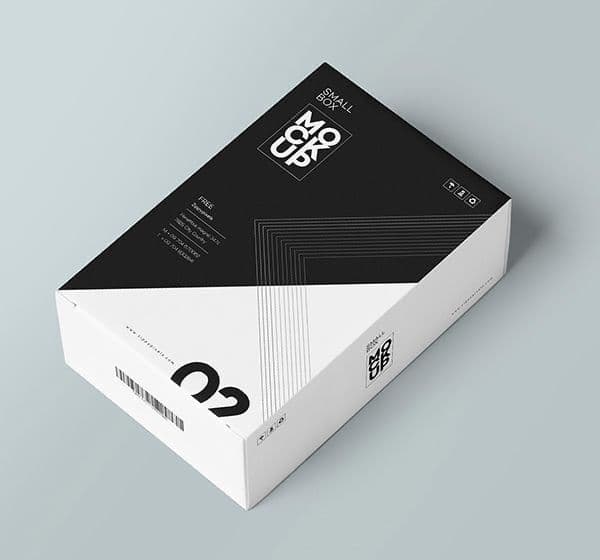
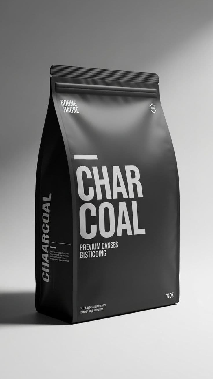
By intentionally using white space and removing unnecessary decorative elements, designers create clean layouts and focused visual hierarchies that allow the product itself to breathe. This makes it easier for customers to immediately notice the brand logo, product name, or core selling point without distraction.
How Minimal Packaging Builds Brand Value
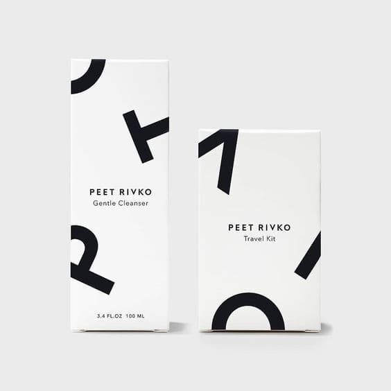
Luxury skincare packaging is a perfect example. Many premium brands use large areas of negative space, subtle typography, and restrained colour palettes with little or no excessive graphics. The result feels sophisticated, modern, and memorable. Consumers can instantly recognise the brand and understand the product at a glance.
This “empty space” is not wasted space. It is strategic design.
A well-balanced minimalist package reduces visual fatigue, improves readability, enhances product recognition, and creates a stronger emotional connection with the consumer. In an increasingly noisy retail environment, simplicity often stands out more powerfully than complexity.
At Social Canvas, we believe great packaging design is not about adding more — it is about creating clarity, purpose, and lasting brand value through thoughtful visual communication.